The six images are listed below in the wrong order. Please, before you read this, try to decide what the Bees are showing. The answer is given at the end.
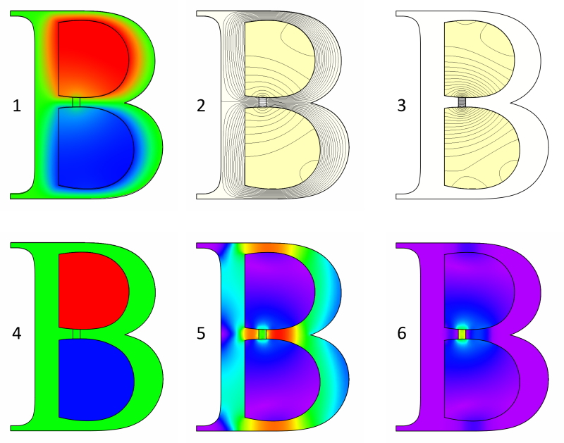
(b) Contour plot of J (current-density)
(c) Contour plot of H (magnetic field strength)
(d) Lines of H
(e) Lines of B
(f) Contour plot of A (magnetic vector potential)
Fig. 2 shows a magnetic letter B, in which current flows in one direction in the upper aperture U, and in the opposite direction in the lower aperture L. The two parts of the B form closed loops of magnetic material (steel) except for the air-gap g in the bridge b. The model is 2-dimensional.
Actually this is not so fanciful as it might appear. The topology is the same as that of a gapped reactor core, or transformer core, except that the shape has been distorted into the outline of the letter B. The reason for the distortion is to make a more entertaining shape for discussion, but it introduces or emphasizes some characteristics (mostly negative ones) that might easily be missed in a real reactor core with boring old rectangular geometry. We’ll see if we can identify some of these.
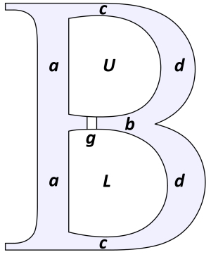
Fig. 1 shows six different ways in which the electromagnetic field (or components thereof) can be depicted graphically. The differences between them are quite striking. It is obviously useful to be able to "read" these charts, and understand the meaning of the different details in them.
Starting with 4, this is a simple contour plot of the current-density. Positive current fills the upper aperture U, and negative current the lower aperture L. The current-density J is about 5 A/mm2 in the z-direction normal to the plane of the diagram. The current-density is strictly confined to the two conducting regions. No current whatsoever leaks out into the iron core acdbdca.
In 1 we see the magnetic vector potential A. Like J, it has only one component in the z direction, and we can think of it as showing the influence of the current-density J. Unlike J, A does "leak" or make itself felt outside the conducting regions, as it must : since B = curl A, we must have some measure of A in all the regions where we have B.
This brings us to the flux-lines of B in diagram 2, which is familiar and possibly the most common depiction of the magnetic flux. It is also the oldest — indeed, early finite-element programs could produce only this chart. The lines are actually contours of constant A (really Az), and the difference of Az between any two lines is equal to the flux lying between them (per metre of length in the z-direction). But we almost never think of them like that. Instead we see them simply as "flux lines".
In 5 we see the contour plot of B, which is also very common. 2 and 5 together are probably the most widely used charts for examining the field of flux. They are often plotted together.
In 3 we see lines of H, the magnetic field strength. Now this chart has been constructed by suppressing the steel core acdbdca in JMAG, plotting the flux-lines, and presenting them as lines of H. The division between lines has been changed so that we see rather more lines than those of B in 2. The outline has been superimposed at the end. The reason for this "dodge" is that JMAG doesn’t have an option to plot lines of H. Lines of H are discontinuous at boundaries where there is a change of permeability, and since the permeability of the steel core is high, H inside the steel core is small. By that argument we can justify the omission of lines of H in the steel core region. They are there, but very sparse. In the conducting regions, B and H are linearly related, so their "flux" lines have the same shape. (Incidentally, it’s an interesting problem to make an algorithm for plotting contour lines of discontinuous variables).
Going back to 2, wouldn’t we expect the lines of B to enter the steel normally (that is, perpendicular to the steel surface) in passing from the conducting regions into the core? Most of them are normal to the surface, or nearly so; but some are not. The deviation is greatest along the bridge section b, which is where the flux-density is highest. In this region the permeability of the steel is much lower than elsewhere, because of the high flux-density. We have to remember that perpendicular entry of flux-lines applies only at the surface of an infinitely-permeable material.
Finally in 6 we have a contour plot of H. The purple and blue colours show areas where H is very small. In the steel core, B is high but the permeability is also very high, so H is low. In the conducting regions (which have the same permeability as air), B is low and so H is low. The only region where H is high is in the air-gap region g, where B is fairly high but the permeability is low.
Lastly, let us work through the six charts again, and see what "lessons" we can learn from them.
1 (vector potential contour plot) — very little. (But see Engineer’s Diary No. 35, where we did make use of it).
2 Flux lines — We can see the changing flux-density along the different parts of the steel core. Around the bridge, where the flux-density is highest (about 2⋅3 T), the flux leaks into the conducting region because of the high gradient of H along the x-direction in the bridge, together with the high "MMF drop" across the air-gap. This establishes a high magnetic potential drop in the conducting regions in parallel with the bridge and close to it, and the result is a measurable leakage flux. This is a common result of magnetic saturation. Another consequence is that not all the flux links all the turns of the windings. We can see this from the presence of "stray" or leakage lines of B in the conducting regions. If all the flux were strictly confined to the core, it would all link the windings. The depletion in the flux-linkage is associated with a reduction of the winding inductance.
3 Lines of H in this diagram do not greatly amplify the message from 2 above, so this chart is rarely used.
4 The current-density contour plot is of little interest here, except as a check to make sure that we have the correct current-density in these regions. In complex models of electrical machines there may be stators with 48 or 72 slots or even more, and even 6 or 9 phases, so this diagram can be useful in checking the current-distribution, and making sure that the winding data has been entered correctly (as well as the directions and magnitudes of the currents). (See Video No. 21).
5 The contour plot of B is common and useful. It shows immediately the areas of high B, where saturation is most pronounced. Conversely it shows the areas of low B. In many cases these observations provide guidance for thickening some sections of the magnetic circuit (such as the bridge b in this example); or for removing material where little or no flux is being carried. Under AC conditions the contour plot of B also shows where the core-loss will be highest.
6 The contour plot of H is less useful (and less frequently used) than the B contour plot, but it is still useful to show where the precious MMF is being "dropped" or "used up". Ampère’s law tells us that around any closed path enclosing a certain number of ampere-conductors (the MMF or magnetomotive force), the line-integral of H is fixed and equal to the MMF. Since these ampere-conductors are precious (and since they generate heat), we need to concentrate them where they will do the most good. In many magnetic circuits (including electrical machines) this means concentrating the MMF across the air-gap, just as we are doing in Fig. 1, and we can see this in 6.
Answer : (a)=5, (b)=4, (c)=6, (d)=3, (e)=2, (f)=1

